Cyclistic Data Analysist Case Study
personalProject | Jan. 6, 2023, 11:33 p.m.
Cyclistic is a case study provided by Google Data Analytics course on Coursera.
The goal is to analyze user behavior, find similarities and differences, determine
trends, and provide recommendations on how these insights can help the
marketing team to create a campaign that would convert one type of users
into another.
ASK
From the scenario above, we can ask 3 questions that could help future marketing program:
- How do annual member and regular riders use bicycles differently?
- Why do regular riders buy annual member bikes?
- How can cyclistic use digital media to influence regular riders to become members?
PREPARE
The dataset provided for this project consists of 12 ‘.csv’ files representing each month from Dec 2021 to Nov 2022. Each table consists of nine columns containing data about all rides that took place in the year 2021-2022:
ride_id
rideable_type: the type of the bike (docked_bike, electric_bike and classic_bike)
started_at: the date and time the ride started at
ended_at: the date and time the ride ended at
start_station_name: station’s name the ride started at
start_station_id: station’s ID the ride started at
end_station_name: station’s name the ride ended at
end_station_id: station’s ID the ride ended at
start_lat: latitude of the start station
start_lng: longitude of the start station
end_lat: latitude of the start station
end_lng: longitude of the start station
member_casual: casual rider or member rider
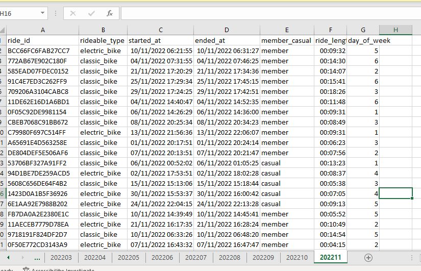
Import the files to Microsoft Excel with the ride_id as text not general, and by just a glimpse inspection to all the data, we can see some nulls and inconsistent data especially at the start_station_name, toward the end_lng.
PROCESS
The cleaning process consists of these steps :
- Remove duplicate to make sure no duplicated data
- Making sure the consistency of ride_id which is the primary key with len ride_id(result = 16) -> conditional formatting if cell value !=16 then remove the cell that are highlighted with go to special
- Apply conditional formatting with blank cell. At this step, I found a lot of blank data on start_station_name, start_station_id, end_station_name, end_station_id, start_lat, start_lng, end_lat, and end_lng. And for some reason I decided not to include those columns(even tho now I regret not including the start_lat, start_lng, end_lat, and end_lng for the potential distance length)
- I add 2 new columns which is ride_length from calculating ended_at minus started_at, and weekday using the weekday function with started_at column.
- Run conditional formatting to check the error on the new column and found some value error at ride_length column. Fixed with switching the value of started_at and ended_at.
ANALYZING DATA & SHARE
For the initial analyzing, I use SQL including combining it all to become an annual data and then proceed it for visualization with Tableau.
I run some SQL query such as count the total data group by casual_member and month by extracting it from started_at, count the total data group by casual_member and weekday, etc. You can see it on the data viz below or click here to see it on tableau public.
From the data visualization above, we can see that member and casual rider have some dissimilarities, such as how casual rider mostly ride bike on holiday (Saturday & Monday), how they take longer ride than member, how casual rider use it on certain hour especially the wee hour, and how no member use the docked bike.
We can also see bike usage peaked at June 2022 it most likely because of the event World bicycle day and World Environment day. Bike usage also peaked in September 2022, but I'm not really sure why(I don't really familiar with what happening in the US at that time and when I search for it, I can't find anything related). In the case of usage by hour/time, it peaked at 7 AM for member and 5 PM for both member and casual rider.
ACT
Based on the findings, here are a few recommendations that can be taken :
- Offering new types of membership focused on weekend rides to attract casual riders.
- Advertising membership bonuses for people who enjoy longer rides.
- Utilizing digital media to target regular riders during peak usage times and on weekends.
- Create a campaign that emphasizes the benefits of annual membership, such as discounts and exclusive access to certain types of bikes.
Overall, the case study provides valuable insights into rider behavior and offers actionable recommendations for how Cyclistic can improve its marketing strategy to convert more casual riders into annual members.